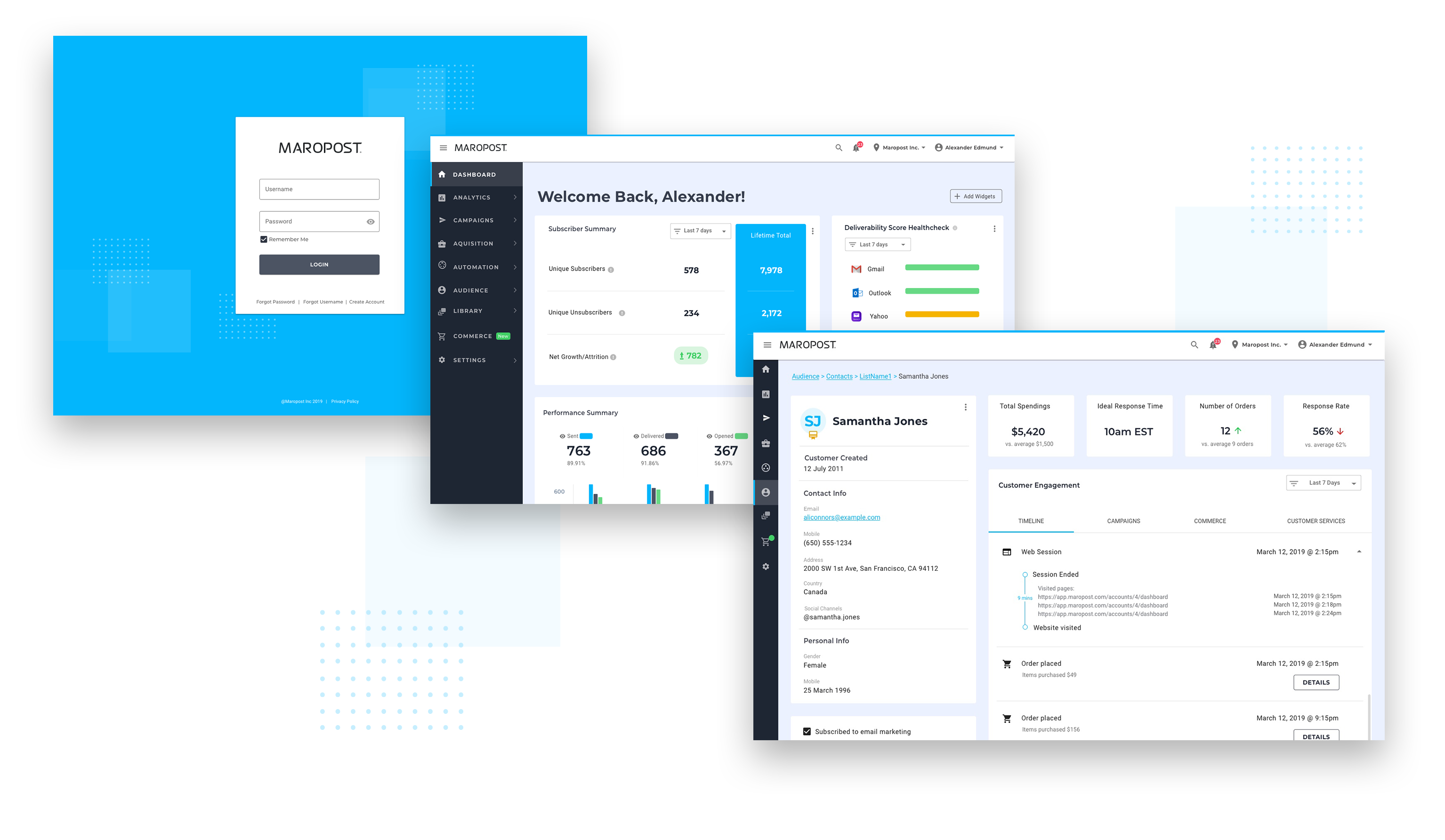
At Maropost, it really is about being bold because we believe that boldness is what pushes us forward to deliver even more value to our customers. They are the heartbeat of our company. They have to be. And today, I am absolutely thrilled to bring you some very exciting news! For the past few weeks, my team has been working to deliver to our customers a completely redesigned user interface to our platform.
And it’s not just changing the color of a few buttons. We believe this is going to transform the way our customers interact with our platform. We’re building from the ground-up by redesigning the layout, streamlining the workflow, and adding new capabilities and features that focus on better experiences and outcomes for our customers.
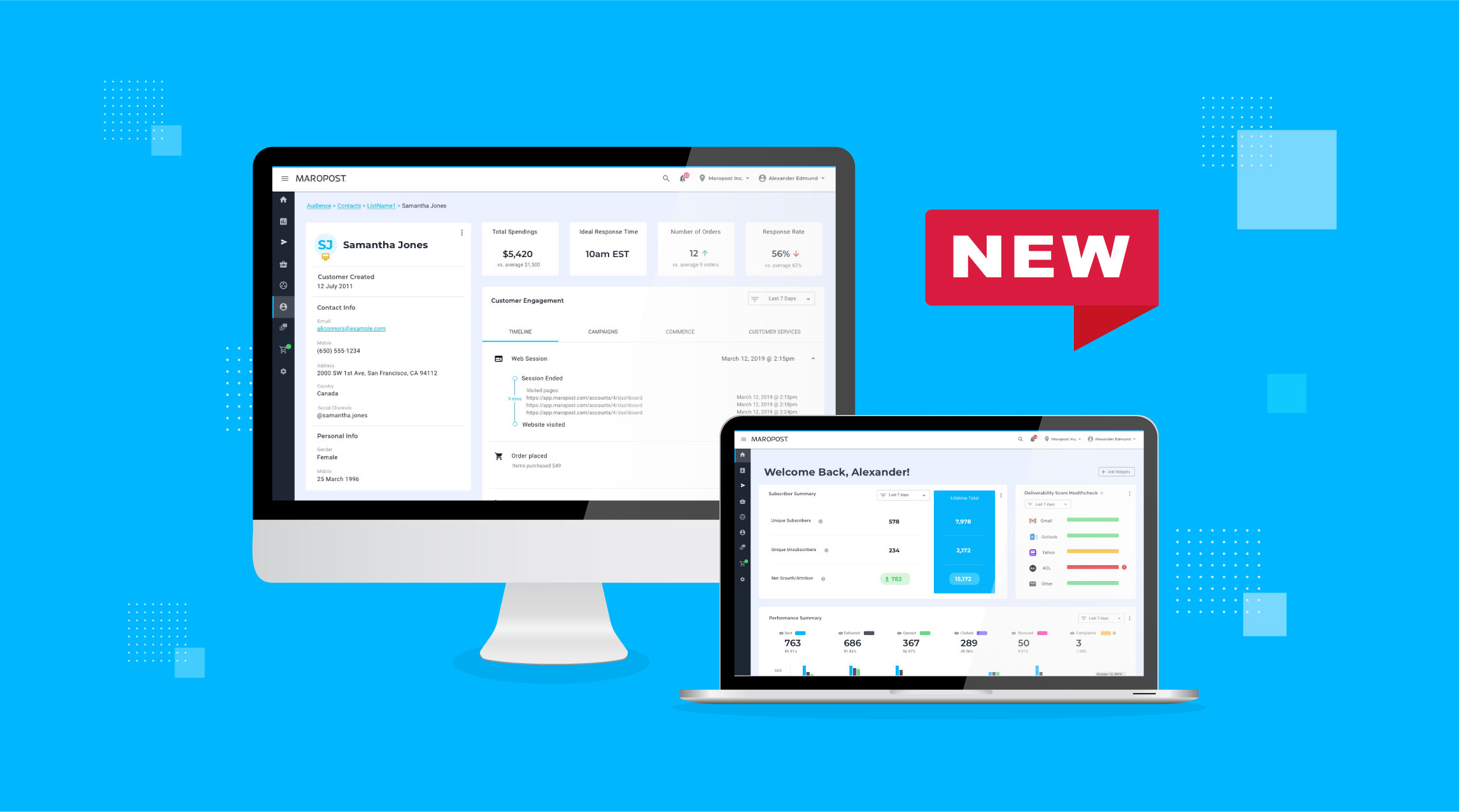
Here are some early designs of what the new interface is going to look like.

What’s next?
We still have a ways to go before we can put this in the hands of our customers. However, we want to bring you along on this journey. Each week, our User Experience Lead, Sveta Fedarava, will be publishing new stories, learnings, discoveries and insights about our efforts into this redesign.
Until our next post, I would love for you to be a part of our Innovations Community to preview the new interface and provide direct feedback. If interested, I encourage you to sign up here.
Need to chat about your mobile marketing strategy?
More than 10,000 marketers use Maropost to engage with their prospects and customers through emails, SMS, social media and more. We’re here to help you growing your business!
Chat Now
