As an email marketer, you spend a lot of time preparing emails to go out. From writing the email copy, to personalizing it for different segments, to scheduling your send time, there’s a lot to account for before you can even consider putting your emails out into the world. But your work doesn’t end after you press send. Once your email has gone out, you need to consider a few key factors that determine whether it was a hit (or a miss).
- Are your subscribers engaging with it?
- Is it leading to conversions?
- Is it contributing to revenue?
But before you can ask these questions, you need to ask a more critical question: Is your email arriving in the inbox?
Most of us know that we need to work on our deliverability, but what you might not know about is the role that improving design plays in improving your deliverability. To help show you how you can use design to boost deliverability, the team at Looka has put together a few of our top tips for designing for deliverability.
What is Email Deliverability?
Now, I know we said that most email marketers are familiar with deliverability, but in case you’re a bit rusty, here’s a quick definition. Simply put, deliverability is all about whether or not your marketing emails actually reach the inbox. Factors like bulking, spam issues, bounces, throttling, and ISP issues can all stand in the way of your emails arriving at the address you sent them to.
With this definition of deliverability in mind, let’s dive into how you can use design to improve your email deliverability rates.
How Does Email Design Impact Email Deliverability?
By now, most of us know the basics of deliverability, including things like verifying subscriber email addresses of your mailing list, using double opt-ins for your email list, and optimizing your subject lines for a better open rate. What people might not realize is that design also plays a big role in deliverability, but not in the way you might think.
There are a few difficulties design can cause that might prevent your emails from arriving in the inbox—and a few quick improvements you can make to boost deliverability.
Difficulty Unsubscribing
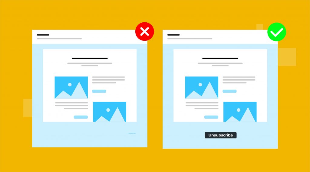
If your email design hides or makes it hard to find your unsubscribe link, you could be doing your deliverability a disservice. If people can’t unsubscribe, they’re more likely to mark your emails as spam. After enough spam complaints, you’ll end up landing in the spam folder or bouncing. Consciously designing your unsubscribe link to be more visible might lose you some subscribers, but it will also lose you some spam reports.
Difficulty Loading
Too many images, fonts, or colors, can cause a hit to your deliverability. In general, you should try to keep your image to text ratio at 60% text to 40% images. When you add more images than this ratio, filters might start to see your emails as spammy.
As for fonts and colors, the issue is less about filters and more about subscriber experience, since some colors and fonts don’t show up on all ISPs. When people can’t read your emails, they’re more likely to see them as spammy or avoid engaging with them.
Difficulty Reading
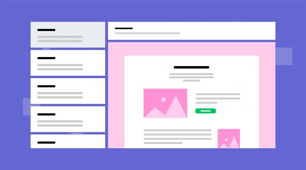
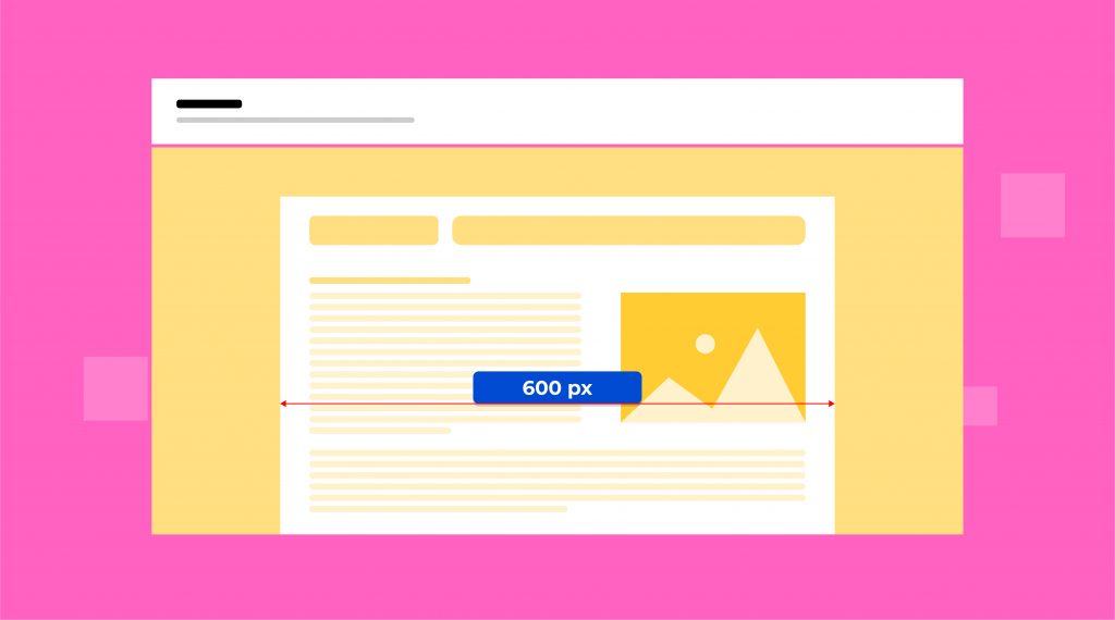
Poorly structured content can make it hard for readers and ISPs to make sense of your emails. As a rule, you’ll want to stick as closely as you can to a 600 pixel, single-column design. That way, your emails will be more responsive across screens, making them easier for subscribers to view.
Additionally, a simple structure forces you to prioritize content. A good content hierarchy makes it easier for readers to understand your emails and less likely to get confused by their content. If you want to upgrade to a more complex layout, be ready to thoroughly test your emails across devices to avoid any potential responsive design mishaps.
Difficulty Trusting
Even if you do everything right with your image ratios and email layouts, your emails might still be seen as spam. Being aware of what words, symbols, or images might give off a spammy impression can help prevent your emails from being seen as suspicious.
Improving deliverability can sometimes be as simple as swapping your image style and word choice for something else. Remember: your subscribers are smart; if you give them any reason not to trust you, they’ll take it.
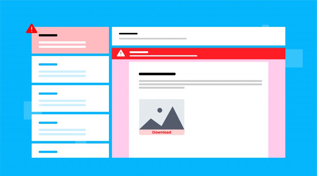
Designing Emails to Increase Deliverability
All of these ‘deliverability don’ts’ for email design have one common thread: simplicity is key. Simpler unsubscribes, fewer images, limited fonts and colors, and streamlined layouts may be what’s best for deliverability, but there’s one problem with going this route. Even though a single-column, all-text, Times New Roman, black and white email might be what’s best for improving deliverability, you need to consider more than just what gets you in the inbox.
Email engagement is a key factor in email deliverability, since ISPs want their users to receive the emails they want to receive (and filter out the emails they don’t want to receive). So, while you should be simplifying your design to increase deliverability, you shouldn’t be abandoning your design sense altogether. Learning to balance design decisions with deliverability decisions will help you arrive in the inbox—and actually get engagement once you’re there.
As you consider where to invest your email design efforts (without disrupting your email deliverability), your focus should be on your brand. Consistent use of your brand identity in your emails will build an affinity for your brand over time. Becoming a familiar face in your subscribers’ inboxes means they’re more likely to open and click through your emails.
Strategically incorporating your brand identity elements in your emails can help you make the most of your design choices. Elements to consider include:
- Email sender is important: ensure your company name is included in your send name or subject line
- Not sacrificing brand voice for the sake of a catchy subject line
- Adding your logo and company name to your email headers
- Incorporating company colors in your borders, headers, and footers
- Using company fonts (or similar universal fonts) in your email copy
- Repeating company imagery from other marketing materials in your emails
- Maintaining a consistent company voice between email copy and other marketing materials
- Creating a similar content structure and density between emails and other marketing materials
While these tips cover more than just design elements, so does your brand. If you go through the trouble of incorporating your brand’s visual elements into your emails, you better be putting in the work to incorporate your other brand elements into your email campaigns.
By prioritizing your brand when sending emails, both in design and other choices, you can create the kind of engagement that does more for improving your email delivery. As you learn to balance simplicity and brand identity in your email design, you’ll be well on your way to becoming an email that not only lands in the inbox, but also an email that your subscribers look forward to opening every time it arrives.
Need to chat about your mobile marketing strategy?
More than 10,000 marketers use Maropost to engage with their prospects and customers through emails, SMS, social media and more. We’re here to help you growing your business!
Chat Now
